NEW CONCEPT FOR THE FOOTWEAR AREA OF THE FLAGSHIP STORE IN ROME
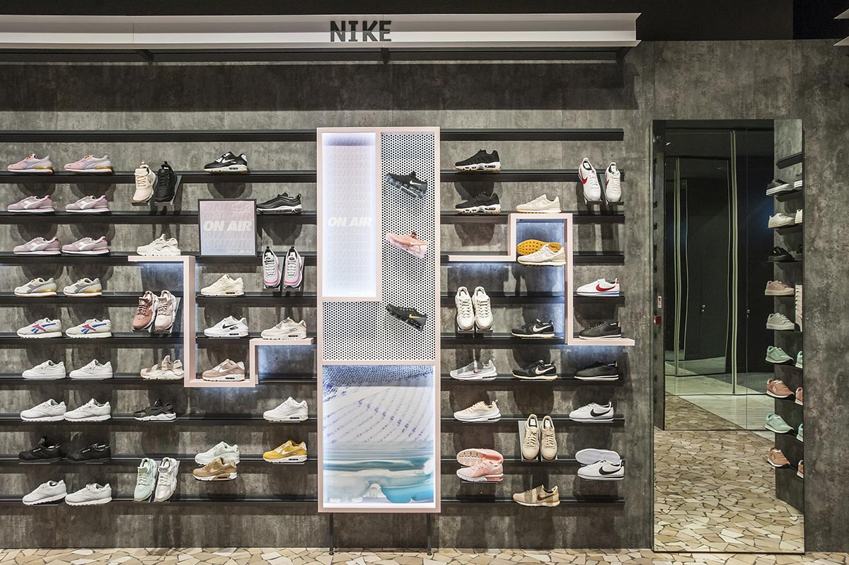
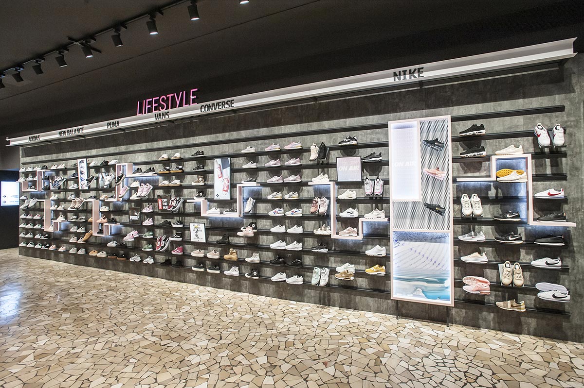
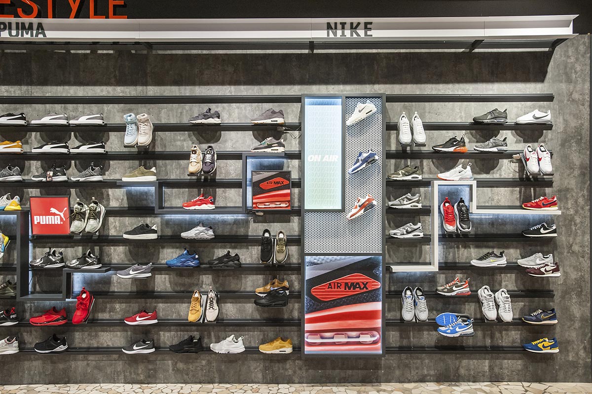
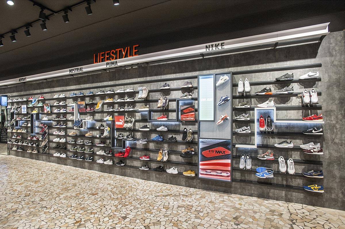
Over and above the women’s area of Cisalfa, we have also been entrusted with the project of Footwear Wall. The main challenge of this project was to keep the original product capacity unchanged, while breaking the linearity that in inevitably typical of a traditional shoe wall.
Therefore we designed three types of additional display elements: the Tetris Shelves, in three variants, the Focus Points and the bases for the frontal display. These details allowed to create visual anchors to capture the attention and bring out certain products through simple vertical layouts obtained with the bases, but also the shelf lights, until the achievement of the maximum exposure through the Focus Points and the magnetic graphic elements. A true hierarchical code at the service of the exhibition.
The materials used (painted metal sheets, LED strips and painted perforated metal sheets) follow two different color palettes: for the Male Footwear two shades of gray were selected, while the female section uses white and pink, two colors already seen in the women’s sportswear department.


